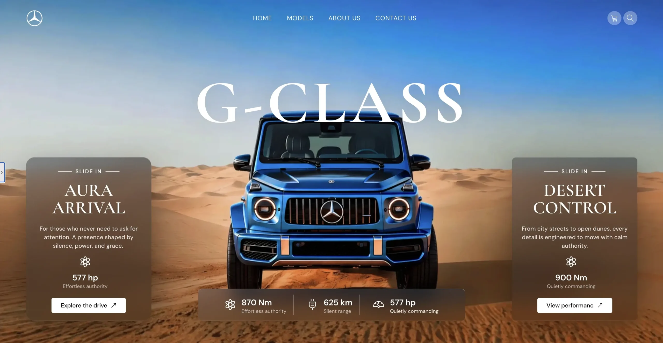
.glass-card {
  position: relative;
  overflow: hidden;
  isolation: isolate;

  background: linear-gradient(
    180deg,
    rgba(35, 48, 62, 0.55) 0%,
    rgba(20, 28, 34, 0.42) 100%
  );

  backdrop-filter: blur(22px) saturate(140%);
  -webkit-backdrop-filter: blur(22px) saturate(140%);

  border: 1px solid rgba(255, 255, 255, 0.22);
  border-radius: 22px;

  box-shadow:
    inset 0 1px 0 rgba(255, 255, 255, 0.28),
    inset 0 -1px 0 rgba(255, 255, 255, 0.08),
    0 24px 70px rgba(0, 0, 0, 0.35);

  --x: 50%;
  --y: 50%;
}

/* Beholder din glass effect */
.glass-card::before {
  content: "";
  position: absolute;
  inset: 0;
  border-radius: inherit;
  pointer-events: none;

  background: linear-gradient(
    135deg,
    rgba(255, 255, 255, 0.22) 0%,
    rgba(255, 255, 255, 0.06) 35%,
    rgba(255, 255, 255, 0.02) 100%
  );

  opacity: 0.55;
  z-index: -1;
}

/* Hover glow */
.glass-card::after {
  content: "";
  position: absolute;
  inset: 0;
  border-radius: inherit;
  pointer-events: none;

  background: radial-gradient(
    180px circle at var(--x) var(--y),
    rgba(255, 255, 255, 0.55),
    rgba(255, 255, 255, 0.18) 35%,
    transparent 70%
  );

  opacity: 0;
  transition: opacity 0.25s ease;
  z-index: 2;
}